Colours and materials are important factors in the realm of interior and spatial design as they play a role in shaping environments that directly affect the user’s lifestyle.
Colour theory has a great impact on human psychology and emotions affecting how one interacts within a space. Selecting colours influences moods and the perception of a space. By understanding different contrasts, hues, values and harmonies along with spatial effects, a space can be transformed into a more dynamic and emotionally balanced atmosphere.
Materials can elevate a design by allowing for sensory experiences and the choice of materials affects not only the aesthetics but also the durability, sustainability and functionality. For example, wood can offer a sense of warmth whereas metal can present a sleek and industrial fleeing. Materials act as a tangible language through which design communicates.
This work explores colour theory and material exploration within interior spaces. Colours and materials work together to evoke feelings in space and it is important to consider the experience of those who inhabit the space. By using a combination of colours and materials, interior and spatial design should aim to bring depth, personality, and purpose to the places we live, work, and experience.

Monochromatic
This image is an example of a monochromatic colour scheme which means that there is one colour used with difference values and intensities. The designer has used green as the main colour and used different shades, textures and patterns to create an inviting space.
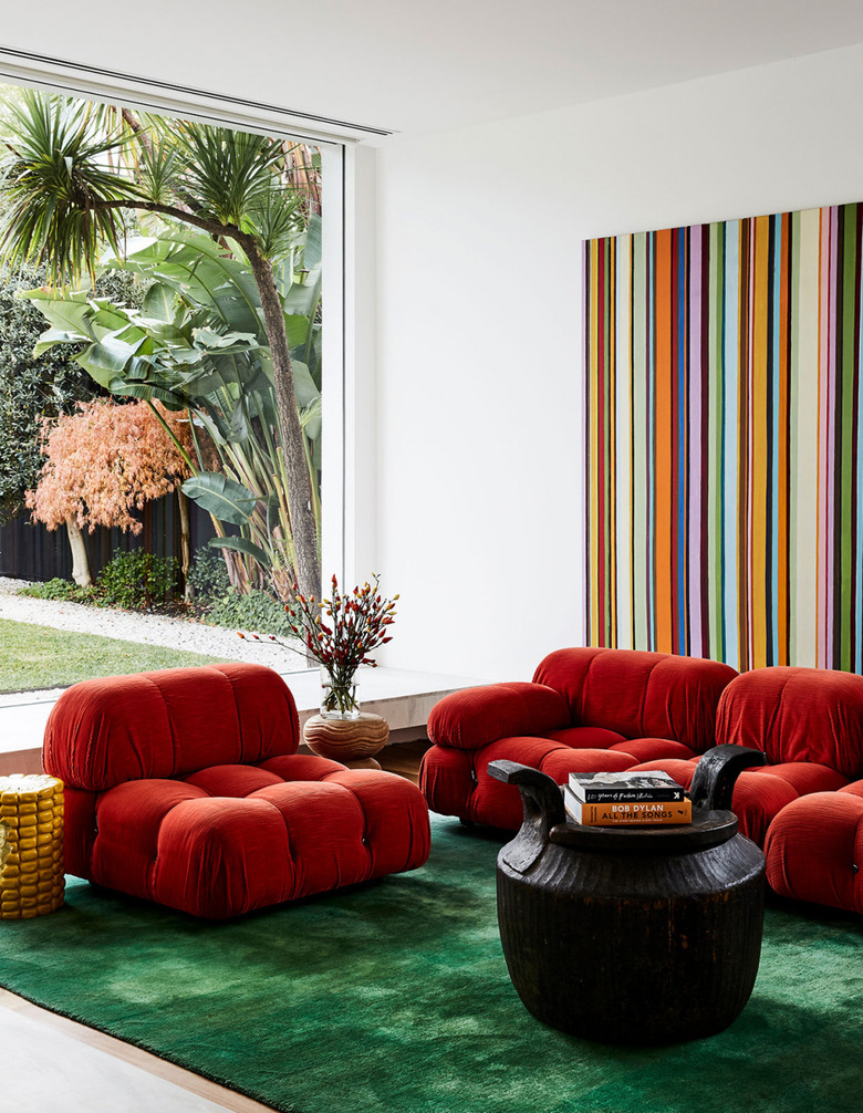
Complementary
Complementary colours are when the colours are opposite on the colour wheel. In this case, the red and green contrast each other extremely well offering a bold and stylish living space.
https://www.hunker.com/13727088/complementary-color-ideas-and-inspiration?
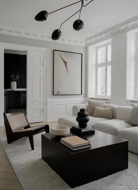
Achromatic
Achromatic means that the use of black greys white and neutrals are highly present. In this image, the neutrals are reflected in the weaving on the lounge chair, pillows on the sofa and the wood floors. The black and white aspects are see in the contrast between the sofa and the lounge chair alone with the black ceiling lamp and white carpet. Grey is represented in the paint colour on the wall.
https://www.digsdigs.com/25-refined-ways-to-use-molding-in-your-home-decor/